React Native video player
Last updated: May-01-2026
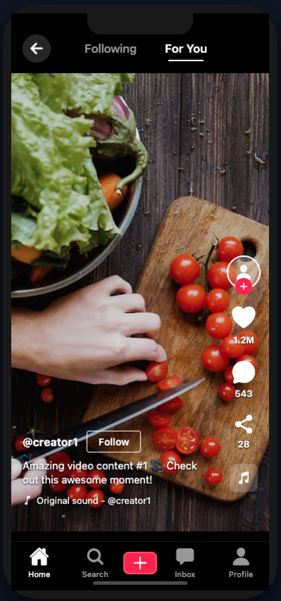
The React Native SDK includes Cloudinary native video player components that make it easy to deliver your videos using the device's native player. For Android, the player uses ExoPlayer and for iOS it uses AVPlayer.
Video player options
The SDK provides two video player components:
-
AdvancedVideo: A basic video player component with optional analytics tracking -
CLDVideoLayer: An advanced video player layer with overlay controls, seekbar, customizable buttons, subtitles, quality selection, and more
Basic video player
The AdvancedVideo component provides video playback capabilities with optional analytics tracking.
AdvancedVideo component requires either expo-av (Expo SDK 50-51) or expo-video (Expo SDK 52+) to be installed.Basic usage
To create a player, use the AdvancedVideo component and provide a Cloudinary video object or the full Cloudinary URL. You also need to define a height and width for the video player to display correctly:
You can also use a direct URL:
Video transformations
You can include video transformations when creating your video instance, for example:
Analytics
Enable analytics tracking for detailed video performance insights:
Advanced video player with custom controls
The CLDVideoLayer component provides a comprehensive full-screen video player with customizable controls, overlay buttons, and advanced features.
CLDVideoLayer component requires @expo/vector-icons and expo-font in addition to either expo-av or expo-video.Installation
Install the required dependencies:
Features
The CLDVideoLayer component includes:
- Full Video Controls: Play/pause, seek, volume, and playback speed controls
- Flexible Button Positioning: Place custom buttons anywhere on the video overlay using compass-style positioning (North, South, East, West, and combinations)
- Horizontal/Vertical Button Layouts: Control how you arrange multiple buttons in button groups
- Share Functionality: Built-in sharing capabilities with customizable share handlers
- Playback Speed Control: Customizable playback speeds (0.5x, 1x, 1.25x, 1.5x, 2x, and more)
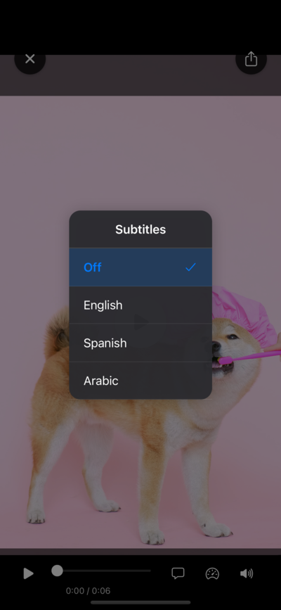
- Subtitle Support: Automatic HLS subtitle parsing and custom subtitle language configuration
- Quality Selection: Automatic HLS quality detection and manual quality selection options
- Full Screen Support: Landscape-optimized full screen mode with custom callbacks
- Auto-hide Controls: Controls automatically fade after 3 seconds of inactivity
- Responsive Design: Automatically adapts to portrait and landscape orientations
- Bottom Button Bar: Additional button bar positioned below the seekbar
- Title and Subtitle Display: Show video titles and subtitles with customizable positioning
Basic usage
Button positioning
The CLDVideoLayer component allows you to position buttons anywhere on the video overlay using the ButtonPosition enum.
Available positions
The following positions are available:
Single button example
Position individual buttons using the backButtonPosition and shareButtonPosition props:
Button groups
You can create groups of multiple buttons with customizable layouts using the buttonGroups prop.
Vertical layout
By default, buttons in a group stack vertically:
Horizontal layout
Arrange buttons horizontally using ButtonLayoutDirection.HORIZONTAL:
Share functionality
The component includes built-in share functionality.
Default share behavior
Use the default share implementation:
Custom share handler
Provide a custom share handler for more control:
Playback speed control
Enable playback speed control with customizable speed options:
Subtitles
The component supports both manual subtitle configuration and automatic subtitle detection from HLS videos.
Manual subtitle configuration
Define available subtitle languages manually:
Automatic HLS subtitle detection
For HLS videos (.m3u8), subtitles are automatically detected from the manifest:
Quality selection
Enable quality selection with manual or automatic quality detection.
Manual quality configuration
Define available quality options:
Automatic HLS quality detection
For HLS videos, quality levels are automatically detected from the manifest:
Full screen support
Enable full screen mode with optional landscape-only orientation and custom callbacks:
Seekbar customization
Customize the seekbar appearance and time display position:
Bottom button bar
Add a customizable button bar positioned below the seekbar:
Title and subtitle
Display a video title and subtitle with customizable positioning:
Complete example
Here's a comprehensive example demonstrating multiple features:
Props reference
AdvancedVideo props
| Prop | Type | Description |
|---|---|---|
cldVideo |
CloudinaryVideo |
Cloudinary video object (required if videoUrl not provided) |
videoUrl |
string |
Alternative video URL (required if cldVideo not provided) |
videoStyle |
StyleProp<ViewStyle> |
Style for the video container |
enableAnalytics |
boolean |
Enable video analytics tracking |
autoTrackAnalytics |
boolean |
Automatically track analytics events |
analyticsOptions |
object |
Configuration options for analytics |
CLDVideoLayer props
| Prop | Type | Description |
|---|---|---|
cldVideo |
CloudinaryVideo |
Cloudinary video object (required) |
videoUrl |
string |
Alternative video URL |
autoPlay |
boolean |
Auto-play video on load |
muted |
boolean |
Start video muted |
onBack |
() => void |
Back button handler |
onShare |
() => void |
Custom share handler |
hideControls |
boolean |
Hide all video controls |
showCenterPlayButton |
boolean |
Show large center play button (default: true) |
backButtonPosition |
ButtonPosition |
Position of back button |
shareButtonPosition |
ButtonPosition |
Position of share button |
seekBar |
seekbarConfig |
seekbar customization options |
fullScreen |
FullScreenConfig |
Full screen configuration |
playbackSpeed |
PlaybackSpeedConfig |
Playback speed options |
subtitles |
SubtitlesConfig |
Subtitle configuration |
quality |
QualityConfig |
Quality selection configuration |
buttonGroups |
ButtonGroupConfig[] |
Multiple button groups with layout control |
bottomButtonBar |
BottomButtonBarConfig |
Bottom button bar configuration |
title |
string |
Video title displayed in top-left |
subtitle |
string |
Video subtitle displayed below title |
titleLeftOffset |
number |
Custom left offset for title positioning |
Button layout directions
The layoutDirection property in button groups accepts the following values:
-
VERTICAL(default): Buttons stack vertically (top to bottom or bottom to top) -
HORIZONTAL: Buttons arrange side by side (left to right)
Responsive design
The CLDVideoLayer component automatically adapts to:
- Portrait/Landscape orientation changes
- Different screen sizes
- Platform differences (iOS/Android)
- Safe area considerations
HLS video support
For HLS videos (.m3u8 files), the CLDVideoLayer component automatically:
- Detects available subtitle tracks from the manifest
- Parses quality levels and bitrates
- Enables adaptive streaming with manual override options
 Ask AI

