 Ask AI
Image and video adaptability
Last updated: Jul-24-2026
Digital accessibility ensures that everyone, regardless of ability, can access, understand, and engage with online content. When it comes to media content, this includes ensuring that images and videos can be viewed effectively across different device orientations and screen sizes.
Making images and videos adaptable means that content isn't restricted to a single display orientation. This is particularly important for users who may need to view content in different orientations for various reasons:
- Fixed device mounting: Users with mobility impairments may have devices mounted in a fixed orientation (e.g., on wheelchair arms)
- Visual preferences: Users with low vision may prefer landscape orientation for larger text display
- Situational constraints: Users may be in environments where device rotation isn't practical
- Accessibility needs: Some users may find certain orientations more comfortable for extended viewing
Cloudinary's intelligent cropping features use AI to automatically identify and preserve the most important parts of images and videos when adapting to different aspect ratios and screen sizes. This ensures that users can view content in their preferred orientation without losing key visual information.
Image and video adaptability considerations
| Consideration | Cloudinary Image and Video Techniques | WCAG Reference |
|---|---|---|
|
Consider how users who have devices mounted in a fixed orientation will view your images and videos. They may miss important information if the content doesn't maximize the use of the viewport. |
🔧 Automatic image cropping 🔧 Automatic video cropping |
1.3.4 Orientation |
|
Consider users who need to view content on narrow viewports without losing functionality. They should be able to view and interact with your content on varying device sizes and zoom levels without requiring horizontal scrolling. |
🔧 Responsive images for reflow 🔧 Fluid video player for reflow |
1.4.10 Reflow |
Automatic image cropping
Automatic image cropping helps ensure that images remain accessible and visually appealing across different screen sizes and orientations. This is particularly important for WCAG Success Criterion 1.3.4 Orientation, which requires that content does not restrict its view and operation to a single display orientation.
Automatic image cropping with intelligent object detection
Cloudinary's automatic image cropping uses intelligent object detection to identify and preserve the most important parts of an image when adapting to different aspect ratios. This ensures that key visual elements remain visible regardless of orientation, which is crucial for maintaining accessibility.
In the following demo, notice how the hiking man is always kept in the frame, regardless of the aspect ratio that you select. Auto-cropping (c_auto) together with auto-gravity (g_auto) can achieve this outcome for any image. This means that you can use the same automatic cropping on all your images at scale.
🖼️ Responsive Image Cropping Demo
Current aspect ratio: 16:9 (Landscape) - Click the buttons below to see how the image adapts to different orientations and screen sizes.
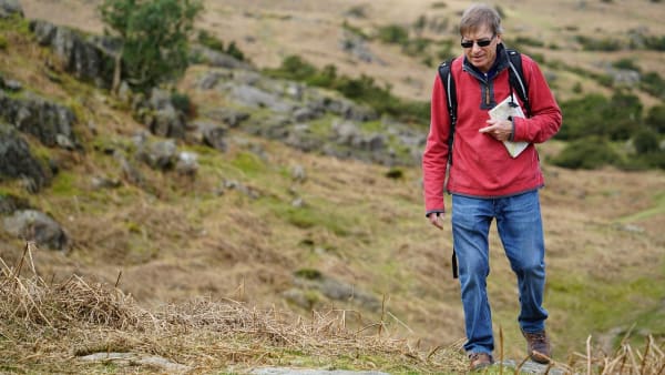
https://res.cloudinary.com/demo/image/upload/ar_16:9,c_auto,g_auto,w_600/f_auto/q_auto/docs/hiking-man.jpg
- Docs: Automatic gravity for image crops
- Video tutorial: Content-aware image cropping
Responsive image implementation
The demo above shows how Cloudinary's automatic cropping works with different aspect ratios. Here's how to implement responsive images that support multiple orientations using the <picture> element:
You can try it out for yourself with a demo built from this code.
Here it is in action. Using dev tools, you can simulate a mobile in different orientations, or simply resize the browser window to request the different images:
- Docs: Responsive images
Automatic video cropping
Automatic video cropping helps ensure that videos remain accessible and visually appealing across different screen sizes and orientations. This is particularly important for WCAG Success Criterion 1.3.4 Orientation, which requires that content does not restrict its view and operation to a single display orientation.
Automatic video cropping with intelligent object detection
Cloudinary's automatic video cropping uses intelligent object detection to identify and preserve the most important parts of a video when adapting to different aspect ratios. This ensures that key visual elements remain visible regardless of orientation, which is crucial for maintaining accessibility.
In the following demo, notice how the important elements are kept in the frame when the video is cropped for a portrait orientation. Auto-gravity (g_auto) is used to achieve this outcome, regardless of the content of the video.
🎥 Responsive Video Cropping Demo
Current orientation: 16:9 (Landscape) - Click the buttons below to see how the video adapts to different orientations with intelligent cropping.
https://res.cloudinary.com/demo/video/upload/ar_16:9,c_fill,g_auto,w_600/f_auto/q_auto/docs/surfer-vid.mp4
- Docs: Automatic gravity for video crops
- Video tutorial: Content-aware video cropping
- Demo: Content-aware video cropping
Responsive video implementation
The following example shows how to implement videos that support multiple orientations using the <video> element with different sources:
You can try it out for yourself with a demo built from this code.
Here it is in action. Using dev tools, you can simulate a mobile in different orientations, or simply resize and refresh the browser window to request the different videos:
Responsive images for reflow
Users should be able to view and interact with your images on narrow viewports and at up to 400% zoom without requiring horizontal scrolling. Responsive images automatically adapt to different screen sizes and zoom levels, ensuring that content flows properly and remains accessible.
Cloudinary provides comprehensive responsive image capabilities. By using responsive image techniques, your images will automatically resize and adapt to the user's viewport, whether they're zooming in for better readability or viewing on different device sizes.
- Docs: Responsive images
Fluid video player for reflow
Similar to images, videos also need to adapt to different viewport sizes and zoom levels. The Cloudinary Video Player's fluid option ensures that videos automatically resize to fit their container while maintaining aspect ratio, making them accessible to users who zoom in on content.
Here's an example of configuring a fluid video player:
Error
Rate this page:
