The Rolling Stones claim, “You can’t always get what you want”.
And when your application needs to crop hundreds or thousands of images to specific sizes within a strictly defined UI design, that frustrating Rolling Stones phrase may be ringing in your ears.
But maybe it doesn’t have to.
There’s no feasible way to crop so many images manually, especially for user-generated content that must be displayed immediately. What you really need is a way to automatically crop all those images to fit your design (or even multiple, responsive designs for different devices). But you need to feel confident that the main area of interest will remain in the final cropped images, regardless of the varied sizes, content, and layout of the original images.
You may already have heard that Cloudinary provides a bunch of automation algorithms that can intelligently adjust your images on-the-fly to automatically deliver the best cropping, quality, and optimization for each image and device. (If you missed it, you can check out Introducing smart cropping, intelligent quality selection and automated responsive images.)
In this article, we’ll do a deep-dive into the smart cropping element of this solution.
In a nutshell, it’s a content-aware algorithm that helps you achieve the best cropping result, regardless of the required dimensions, the main subject, or the positioning and layout of the elements in the picture.
For example, if a user uploaded the portrait-oriented bugs-in-a-flower photo shown on the left, and your app used default (centered) cropping to convert it to a small square image, you would end up with the unfortunate result shown on the right...
But if you simply set the gravity parameter to auto (g_auto in URLs), the algorithm automatically finds the most important elements of the picture on-the-fly, and you get exactly what you want!

Responsive layouts, art direction, and cropping - A Web developer’s challenge:
The art direction for modern websites often requires displaying the same image in different places, shapes, and sizes.
For example, a site’s home page might show square image thumbnails that link to selected articles. Each of those images might be shown as a large landscape picture on the top of the relevant article page, while a zoomed-in excerpt from the same picture might be shown lower down in the article. Other sizes might be used next to search results or in a collage.
Add to this the fact that each of the images probably needs to be presented in totally different sizes and aspect ratios when shown on the responsive mobile version of the site. Plus, larger images may also need to resize responsively as a browser is resized.
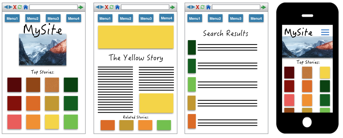
When you multiply all these considerations times the many, many images on a site, the number of unique croppings required becomes somewhat mind boggling. For example, imagine each color below is a unique photo in your site. This gives a tiny glimpse into how many different crops could be required for each image (color) and how many crops overall:
The same image is often shown in varying shapes and sizes
throughout your site and on different devices
And what if the graphic designer shows up one morning with plans to change the look and feel of your site, and you have to change all the shapes and sizes displayed in each and every scenario? I feel a headache coming on…
Luckily, you can use Cloudinary’s transformation capabilities to take a single, high quality original image and crop it on-the-fly to different sizes and aspect ratios, so that you don’t have to crop and re-crop all those images manually. Phew!
But a problem arises if you can’t predict the layout of each image in advance, and how to crop them for each of the required dimensions without losing (or even slicing right through) the most important content. This becomes near impossible when a lot of your images come from user-generated content.
Face-detection based cropping (supported by Cloudinary) works nicely if you expect images to be portrait photographs. But what if your site is showing images of tourist sites, or customers’ favorite meals at local restaurants, or sports action shots?
There’s no way to guess in advance whether to focus on the top, middle, or one side of the pictures. And you can’t even assume that any people in the picture are the main or only region of interest.
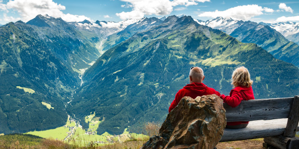
Take this photo of a couple sitting in front of a mountain scene:
If you try generating default thumbnails, using facial recognition, or just request a standard crop using center, some of your displayed images might end up like these:

|

|

|
| 300 X 250 moderate landscape | 200 X 300 portrait | 200 X 200 thumbnail |
Yikes!
Content-Aware Automated Cropping - A Web developer's answer
All you need to do to prevent all of the messy scenarios shown above, is to include the g_auto image manipulation parameter in your delivery URL.
Behind this simple parameter setting is a complex algorithm that evaluates the image pixel by pixel and assigns each area of interest a priority value. If there are faces in an image, they will automatically (unless you specify otherwise) earn a high priority, but other prominent areas of your picture also win high priority points.
In the end, the algorithm chooses the part of the picture containing the most prominent areas in the photo, within the constraints of the other cropping parameters you specify, much the same as a real person would do… replacing the completely infeasible alternative of having a real person sitting 24 hours a day to manually analyze and crop every single one of your professional graphics as well as all user-uploaded content.
And the whole thing happens in the cloud, on-the-fly, so that the resulting cropped image is quickly distributed across the CDN and to your users.
Remember those three awful image crops from earlier in this article? Check out how they look when we add g_auto to the URL:

|

|

|
| 300 X 250 moderate landscape | 200 X 300 portrait | 200 X 200 thumbnail |
So far, we’ve mostly seen examples of how g_auto works when using the fill cropping mode. You can also use g_auto with the thumb cropping mode to zoom in more on the main subjects while still retaining the most important content.
Let’s try this with our flower and bugs picture from the beginning of this article.
- If we use the default (center) gravity, we cut off the best part.
- If we try another area of focus, such as south, which may be useful for some images, we get useless content for this one.
- But with
g_auto, we get a nicely zoomed view of our flower and bugs, right in the center.

|

|

|
|
150 X 150 thumb with default (center) gravity |
150 X 150 thumb with g_south | 150 X 150 thumb with g_auto |
If you want to exert some extra influence on what the algorithm thinks is important, you can use one of the special auto gravity parameters, for example to tell it to give higher or lower priority to faces, or to impact the aggressiveness of the zoom when using g_auto with thumbnail cropping. For details, have a look at the Automatic cropping documentation.
Of course no algorithm is perfect one-hundred percent of the time, and what’s important in an image can sometimes be subjective. So for these special exceptions, you can save custom cropping coordinates with a particular image. You can set these coordinates in an upload command, using the Admin API, or using the Media Library UI. Any specified coordinates will override the g_auto algorithm, or you can optionally set your transformation to still use the g_auto algorithm, but to give a higher priority to your specified coordinates.
At Cloudinary, we love to learn and get better, so when you use custom coordinate overrides, we use that as input that can potentially improve our algorithm in the future.
Cropping for Responsive Design
We mentioned above that one of the many reasons you may need to crop images relates to resizing in response to browser size.
To get the best image crops when your responsive art direction requires different aspect ratios for different screen sizes, just use automatic image cropping (g_auto) together with your fill or thumb crops in the Cloudinary URLs that you supply in your <srcset> and <picture> tags. The responsive images and art-directed responsive images posts, teach you just how to use these tags.
You can even take a step further and add the w_auto or dpr_auto values to your URL, which use Google Client Hints to automatically determine the required width of an image based on the browser's viewport-width or the layout width.
Another option is to use the free Responsive Breakpoints Generator or the Cloudinary API to help you find the optimal responsive image dimensions in each case.
Find out more in the responsive breakpoints generation blog post.
The Bottom Line
So, what’s the bottom line of all this? What’s the main point?
It’s simply that the main point is not always on the bottom line… or the top or the middle for that matter.
With Cloudinary’s content-aware automatic image cropping option, you no longer have to bet on a majority-rule strategy, always focusing on the center or top of all images, nor do you have to get a graphic artist to crop every image manually. Instead, a sophisticated algorithm running in the cloud evaluates each image on-the-fly, and then generates and delivers the image that fits the specified dimensions and is most likely to contain the main focus of the image, enabling you, your graphic artist, and your customers to ‘get what you want’!
This smart automated cropping feature is one element within the full Cloudinary end-to-end offering, which includes programmatic image upload, cloud storage, powerful administration, fast CDN delivery, and a comprehensive image manipulation SDK that enables developers to incorporate these functionalities in their Web and mobile applications with simple code one-liners.
All of the above is available with all Cloudinary's plans, including the free plan.
Open a free account and try it yourself.

