Cloudinary Blog

Push-button Art Direction with Cloudinary’s Responsive Image Breakpoints Generator

Using smart-cropping for automatic art direction

Note: this article was originally published in Smashing Magazine.

Four years ago, Jason Grigsby asked a surprisingly difficult question: How do you pick responsive images breakpoints? A year later, he had an answer: ideally, we’d set responsive image performance budgets to achieve “sensible jumps in file size”. Cloudinary built a tool that implemented this idea, and the response from the community was universal: “Great! Now – what else can it do?” Today, we have an answer: art direction!


Since its release earlier this year, the Generator has been turning high-res originals into responsive <img>s with sensible srcsets at the push of a button. Today, we’re launching v2.0, which allows you to pair layout breakpoints with aspect ratios, and generate art-directed <picture> markup with smart-cropped image resources to match. Check it out, and read on.

Responsive image breakpoints: asked and answered

Why did we build this tool in the first place?

“Responsive images” send different people different resources, each tailored to their particular context; a responsive image is an image that adapts. There are a number of different axes along which that adaptation can happen. Most of the time, most developers only need adaptive resolution – we want to send high resolution images to large viewports and/or high-density displays, and lower-resolution images to everybody else. Jason’s “responsive image breakpoints” question concerns this sort of adaptation.

When we’re crafting images that adapt to fit variable resolutions, we need to generate a range of differently-sized resources. We need to pick a maximum resolution, a minimum resolution, and (here’s the tricky bit) some sizes in between. The max and min can be figured out based on the page’s layout and some reasonable assumptions about devices. But when developers began implementing responsive images, it wasn’t at all clear how to size the in-betweens. Some people picked a fixed step size between image widths – Rectangles showing the relative dimensions of a group of srcset resources that use a fixed-step-size strategy. Rectangles showing the relative dimensions of a group of srcset resources that use a fixed-step-size strategy.

others picked a fixed number of steps, and used it for every range –

Rectangles showing the relative dimensions of three groups of srcset resources that use a fixed-number-of-steps strategy. Rectangles showing the relative dimensions of three groups of srcset resources that use a fixed-number-of-steps strategy.

some people picked common display widths:

Rectangles showing the relative dimensions of a group of srcset resources scaled to common display widths: 300, 512, 600, 768, 800, 1024, 1200 Rectangles showing the relative dimensions of a group of srcset resources scaled to common display widths.

At the time, because I was lazy and didn’t like managing many resources, I favored doubling:

Rectangles showing the relative dimensions of a group of srcset resources scaled using a doubling strategy. Rectangles showing the relative dimensions of a group of srcset resources scaled using a doubling strategy.

All of these strategies are essentially arbitrary. Jason thought there had to be a better way. And eventually realized that we shouldn’t be thinking about these steps in terms of pixels at all. We should be aiming for “sensible jumps in file size”; these steps should be defined in terms of bytes.

For example, let’s say we have the following two JPEGs:

300 pixels wide (41 KB)

300 pixels wide (41 KB)

1200 pixels wide (336 KB)

1200 pixels wide (336 KB)

The biggest reason we don’t want to send the 1200-pixel-wide resource to someone who only needs the small one isn’t the extra pixels, it’s the extra 295 KB of useless data. But different images compress differently; while a complex photograph like this might increase precipitously in byte-size with every increase in pixel-size, a simple logo might not add much weight at all. For instance, this 1000-pixel-wide PNG is only 8 KB larger than a 200-pixel-wide version.

Sadly, there weren’t any readily-useable tools to generate images at target byte-sizes. And ideally, you’d want something that could generate whole ranges of responsive image resources for you — not just one at a time. Cloudinary built that tool!

A screenshot of the Responsive Images Generator

And released it as a free, open source web app.

But the people wanted more…

The next frontier? Automatic art-direction!

So: we built a solution to the the breakpoints problem. And in the process, built a tool that made generating resolution-adaptable images easy. Upload a high-resolution original; get back a fully-responsive <img> with sensible breakpoints and the resources to back it up.

That basic workflow – upload an image, get back a responsive image – is appealing. We’d been focusing on the breakpoints problem, but when we released our solution people were quick to ask — what else can it do?

Remember when I said that resolution-based adaptation is what most developers need, most of the time? Sometimes, it’s not enough. Sometimes, we want to adapt our images along an orthogonal axis: art direction.

Any time we alter our images visually to fit a different context, we’re “art directing”. A resolution-adaptable image will look identical everywhere – it only resizes. An art-directed image changes in visually-noticeable ways. Most of the time, that means cropping, either to fit a new layout, or to keep the most important bits of the image legible when it’s viewed at small physical sizes.

On small screens, we want to zoom in on the image’s subject

On small screens, we want to zoom in on the image’s subject.

People asked us for automatic art direction.

Which is a hard problem! It requires knowing what the “most important” parts of the image are. Bits and bytes are easy enough to program around; computer vision and fuzzy notions of “importance” are something else entirely.

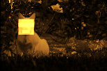
For instance, given this image…

Ruby:
Copy to clipboard
cl_image_tag("white_cat.jpg")
PHP v1:
Copy to clipboard
cl_image_tag("white_cat.jpg")
PHP v2:
Copy to clipboard
(new ImageTag('white_cat.jpg'));
Python:
Copy to clipboard
CloudinaryImage("white_cat.jpg").image()
Node.js:
Copy to clipboard
cloudinary.image("white_cat.jpg")
Java:
Copy to clipboard
cloudinary.url().imageTag("white_cat.jpg");
JS:
Copy to clipboard
cloudinary.imageTag('white_cat.jpg').toHtml();
jQuery:
Copy to clipboard
$.cloudinary.image("white_cat.jpg")
React:
Copy to clipboard
<Image publicId="white_cat.jpg" >

</Image>
Vue.js:
Copy to clipboard
<cld-image publicId="white_cat.jpg" >

</cld-image>
Angular:
Copy to clipboard
<cl-image public-id="white_cat.jpg" >

</cl-image>
.NET:
Copy to clipboard
cloudinary.Api.UrlImgUp.BuildImageTag("white_cat.jpg")
Android:
Copy to clipboard
MediaManager.get().url().generate("white_cat.jpg");
iOS:
Copy to clipboard
imageView.cldSetImage(cloudinary.createUrl().generate("white_cat.jpg")!, cloudinary: cloudinary)
A white cat, off-center

…a dumb algorithm might simply crop in on the center:

Ruby:
Copy to clipboard
cl_image_tag("white_cat.jpg", :aspect_ratio=>"4:6", :crop=>"fill")
PHP v1:
Copy to clipboard
cl_image_tag("white_cat.jpg", array("aspect_ratio"=>"4:6", "crop"=>"fill"))
PHP v2:
Copy to clipboard
(new ImageTag('white_cat.jpg'))
  ->resize(Resize::fill()->aspectRatio('4:6'));
Python:
Copy to clipboard
CloudinaryImage("white_cat.jpg").image(aspect_ratio="4:6", crop="fill")
Node.js:
Copy to clipboard
cloudinary.image("white_cat.jpg", {aspect_ratio: "4:6", crop: "fill"})
Java:
Copy to clipboard
cloudinary.url().transformation(new Transformation().aspectRatio("4:6").crop("fill")).imageTag("white_cat.jpg");
JS:
Copy to clipboard
cloudinary.imageTag('white_cat.jpg', {aspectRatio: "4:6", crop: "fill"}).toHtml();
jQuery:
Copy to clipboard
$.cloudinary.image("white_cat.jpg", {aspect_ratio: "4:6", crop: "fill"})
React:
Copy to clipboard
<Image publicId="white_cat.jpg" >
  <Transformation aspectRatio="4:6" crop="fill" />
</Image>
Vue.js:
Copy to clipboard
<cld-image publicId="white_cat.jpg" >
  <cld-transformation aspectRatio="4:6" crop="fill" />
</cld-image>
Angular:
Copy to clipboard
<cl-image public-id="white_cat.jpg" >
  <cl-transformation aspect-ratio="4:6" crop="fill">
  </cl-transformation>
</cl-image>
.NET:
Copy to clipboard
cloudinary.Api.UrlImgUp.Transform(new Transformation().AspectRatio("4:6").Crop("fill")).BuildImageTag("white_cat.jpg")
Android:
Copy to clipboard
MediaManager.get().url().transformation(new Transformation().aspectRatio("4:6").crop("fill")).generate("white_cat.jpg");
iOS:
Copy to clipboard
imageView.cldSetImage(cloudinary.createUrl().setTransformation(CLDTransformation().setAspectRatio("4:6").setCrop("fill")).generate("white_cat.jpg")!, cloudinary: cloudinary)
The subject of the image has been cropped out of the frame

What you need is an algorithm that can somehow “see” the cat, and intelligently crop in on it.

It took us a few months, but we built this, too, and packaged it up as a feature available to all Cloudinary users: g_auto.

Here’s how it works: when you specify that you want to crop your image with “automatic gravity”, the image is run through a series of tests, including edge-detection, face-detection, and visual uniqueness. These different criteria are then all used to generate a heat-map of the “most important” parts of the image.

The master, rolled-up heatmap

The master rolled-up heat map

A frame with the new proportions is then rolled over the image, possible crops are scored, and a winner is chosen. Here’s a visualization of the rolling frame algorithm (using a different source image):

The rolling frame, visualized. Bluer squares mean higher scores; the green square is the current pick.

The end result? Our cat, front and center:

Ruby:
Copy to clipboard
cl_image_tag("white_cat.jpg", :aspect_ratio=>"4:6", :gravity=>"auto", :crop=>"fill")
PHP v1:
Copy to clipboard
cl_image_tag("white_cat.jpg", array("aspect_ratio"=>"4:6", "gravity"=>"auto", "crop"=>"fill"))
PHP v2:
Copy to clipboard
(new ImageTag('white_cat.jpg'))
  ->resize(Resize::fill()->aspectRatio('4:6')
    ->gravity(Gravity::autoGravity()));
Python:
Copy to clipboard
CloudinaryImage("white_cat.jpg").image(aspect_ratio="4:6", gravity="auto", crop="fill")
Node.js:
Copy to clipboard
cloudinary.image("white_cat.jpg", {aspect_ratio: "4:6", gravity: "auto", crop: "fill"})
Java:
Copy to clipboard
cloudinary.url().transformation(new Transformation().aspectRatio("4:6").gravity("auto").crop("fill")).imageTag("white_cat.jpg");
JS:
Copy to clipboard
cloudinary.imageTag('white_cat.jpg', {aspectRatio: "4:6", gravity: "auto", crop: "fill"}).toHtml();
jQuery:
Copy to clipboard
$.cloudinary.image("white_cat.jpg", {aspect_ratio: "4:6", gravity: "auto", crop: "fill"})
React:
Copy to clipboard
<Image publicId="white_cat.jpg" >
  <Transformation aspectRatio="4:6" gravity="auto" crop="fill" />
</Image>
Vue.js:
Copy to clipboard
<cld-image publicId="white_cat.jpg" >
  <cld-transformation aspectRatio="4:6" gravity="auto" crop="fill" />
</cld-image>
Angular:
Copy to clipboard
<cl-image public-id="white_cat.jpg" >
  <cl-transformation aspect-ratio="4:6" gravity="auto" crop="fill">
  </cl-transformation>
</cl-image>
.NET:
Copy to clipboard
cloudinary.Api.UrlImgUp.Transform(new Transformation().AspectRatio("4:6").Gravity("auto").Crop("fill")).BuildImageTag("white_cat.jpg")
Android:
Copy to clipboard
MediaManager.get().url().transformation(new Transformation().aspectRatio("4:6").gravity("auto").crop("fill")).generate("white_cat.jpg");
iOS:
Copy to clipboard
imageView.cldSetImage(cloudinary.createUrl().setTransformation(CLDTransformation().setAspectRatio("4:6").setGravity("auto").setCrop("fill")).generate("white_cat.jpg")!, cloudinary: cloudinary)
The subject is now front and center

Neat!

It was immediately obvious that we could and should use g_auto’s smarts to add automatic art-direction to the Generator. After a few upgrades to the markup logic and some (surprisingly-tricky) UX decisions, we did it: version 2 of the tool — now with art-direction — is live.

Let’s take a tour

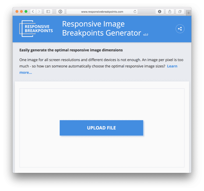
How do you use the Responsive Image Breakpoints Generator?

The workflow has been largely carried-over from the first version: upload an image (or pick one of our presets), and set your maximum/minimum resolutions, a step size (in bytes!), and a maximum number of resources (alternatively, you can simply use our pretty-good-most-of-the-time defaults). Click “generate”, et voila! You’ll get a visual representation of the resulting image’s responsive breakpoints, some sample markup, and a big honkin’ “download images” button.

Screenshot of the tool’s inputs

Screenshot of the tool’s inputs

Screenshot of the tool’s outputs

Screenshot of the tool’s outputs

The new version has a new set of inputs, though, which enable art direction. They’re off by default. Let’s turn a couple of them on and regenerate, shall we?

Screenshot of the art-direction inputs, with “Desktop” and “Smartphone” selected

Screenshot of the art-direction inputs, with “Desktop” and “Smartphone” selected

The first output section is unchanged: it contains our “desktop” (full) image, responsively-breakpointed to perfection. But below it there’s a new section, which shows off our new, smartly-cropped image:

Screenshot of the 1:1 Aspect Ratio section

Screenshot of the “1:1 Aspect Ratio” section

And below that, we now have all of the markup we need for an art-directed <picture> element that switches between the two crops at a layout breakpoint.
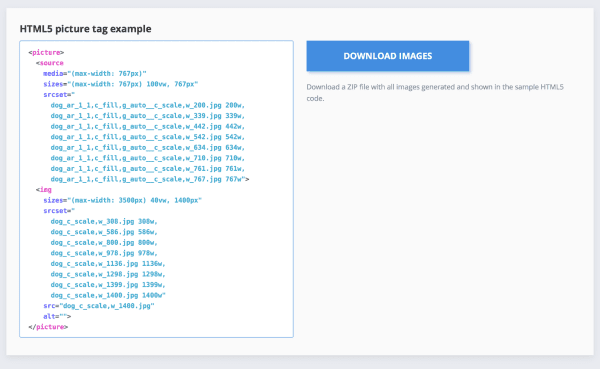
Screenshot of the picture markup section

Screenshot of the markup section

Finally, there’s a live <picture> example, which shows you what all of that markup actually does.

Screenshot of the Live Picture Element in Action section

Screenshot of the “Live Picture Element in Action” section

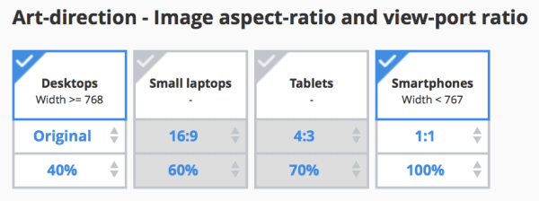
Lets circle back and look at the art direction inputs in a little more detail.

Screenshot of the art direction inputs, annotated to point out what each thing does

Screenshot of the art direction inputs, annotated to point out what each thing does

Each big box maps to a device-type, and each device-type has been assigned a layout breakpoint. The text under the device-type name shows the specific media query that, when true, will trigger this crop.

Below that, we can specify the aspect ratio we want to crop to on this device-type.

Below that, we specify how wide the image will appear relative to the width of the viewport on this type of device. Will it take up the whole viewport (100%), or less than that? The tool uses this percentage to generate simple sizes markup – which reflects/specifies how large the image is on the layout. If you’re using this code in production, you’ll probably want to go back into the example markup and tailor these sizes values to match your particular layout more precisely. But depending on your layout, rough estimates, input here, might be good enough.

And there you have it: simple, push-button art direction.

Automation

What if you want to work with more than one image at a time? If you’re building entire sites, with hundreds, or thousands (or hundreds of thousands!) of images – especially if you’re working with user-generated content – you’ll want more than push-button ease; you’ll need full automation. For that, there’s Cloudinary’s API, which you can use to call the smart-cropping and responsive image breakpoints functions that power the Generator, directly. With the API, you can create customized, optimized, and fully-automated responsive image workflows for projects of any shape or size.

For instance, here’s Ruby code that would upload an image to Cloudinary, smart-crop it to a 16:9 aspect ratio, and generate a set of downscaled-resources with sensible responsive image breakpoints:

Copy to clipboard
    Cloudinary::Uploader.upload("sample.jpg",
        responsive_breakpoints: { 
            create_derived: true,
            bytes_step: 20000,
            min_width: 200,
            max_width: 1000,
            transformation: {
                crop: :fill,
                aspect_ratio: "16:9",
                gravity: :auto
            }
        }
    )

If you’re only working on the front end, all of this functionality is available via URL parameters, too! Here’s a Client-Hints-and-smart-crop-powered URL that does the same thing on download that the Ruby above does at uploadand delivers different, dynamically optimized resources to different devices, responsively:

Ruby:
Copy to clipboard
cl_image_tag("sample.jpg", :use_root_path=>true, :transformation=>[
  {:aspect_ratio=>"16:9", :gravity=>"auto", :quality=>"auto", :crop=>"fill"},
  {:width=>"auto:breakpoints", :crop=>"scale"}
  ])
PHP v1:
Copy to clipboard
cl_image_tag("sample.jpg", array("use_root_path"=>true, "transformation"=>array(
  array("aspect_ratio"=>"16:9", "gravity"=>"auto", "quality"=>"auto", "crop"=>"fill"),
  array("width"=>"auto:breakpoints", "crop"=>"scale")
  )))
PHP v2:
Copy to clipboard
(new ImageTag('sample.jpg'))
  ->resize(Resize::fill()->aspectRatio(AspectRatio::ar16X9())
    ->gravity(Gravity::autoGravity()))
  ->delivery(Delivery::quality(Quality::auto()))
  ->resize(Resize::scale()->width('auto:breakpoints'))
  ->useRootPath(true);
Python:
Copy to clipboard
CloudinaryImage("sample.jpg").image(use_root_path=True, transformation=[
  {'aspect_ratio': "16:9", 'gravity': "auto", 'quality': "auto", 'crop': "fill"},
  {'width': "auto:breakpoints", 'crop': "scale"}
  ])
Node.js:
Copy to clipboard
cloudinary.image("sample.jpg", {use_root_path: true, transformation: [
  {aspect_ratio: "16:9", gravity: "auto", quality: "auto", crop: "fill"},
  {width: "auto:breakpoints", crop: "scale"}
  ]})
Java:
Copy to clipboard
cloudinary.url().transformation(new Transformation()
  .aspectRatio("16:9").gravity("auto").quality("auto").crop("fill").chain()
  .width("auto:breakpoints").crop("scale")).useRootPath(true).imageTag("sample.jpg");
JS:
Copy to clipboard
cloudinary.imageTag('sample.jpg', {useRootPath: true, transformation: [
  {aspectRatio: "16:9", gravity: "auto", quality: "auto", crop: "fill"},
  {width: "auto:breakpoints", crop: "scale"}
  ]}).toHtml();
jQuery:
Copy to clipboard
$.cloudinary.image("sample.jpg", {use_root_path: true, transformation: [
  {aspect_ratio: "16:9", gravity: "auto", quality: "auto", crop: "fill"},
  {width: "auto:breakpoints", crop: "scale"}
  ]})
React:
Copy to clipboard
<Image publicId="sample.jpg" useRootPath="true">
  <Transformation aspectRatio="16:9" gravity="auto" quality="auto" crop="fill" />
  <Transformation width="auto:breakpoints" crop="scale" />
</Image>
Vue.js:
Copy to clipboard
<cld-image publicId="sample.jpg" useRootPath="true">
  <cld-transformation aspectRatio="16:9" gravity="auto" quality="auto" crop="fill" />
  <cld-transformation width="auto:breakpoints" crop="scale" />
</cld-image>
Angular:
Copy to clipboard
<cl-image public-id="sample.jpg" use-root-path="true">
  <cl-transformation aspect-ratio="16:9" gravity="auto" quality="auto" crop="fill">
  </cl-transformation>
  <cl-transformation width="auto:breakpoints" crop="scale">
  </cl-transformation>
</cl-image>
.NET:
Copy to clipboard
cloudinary.Api.UrlImgUp.Transform(new Transformation()
  .AspectRatio("16:9").Gravity("auto").Quality("auto").Crop("fill").Chain()
  .Width("auto:breakpoints").Crop("scale")).UseRootPath(true).BuildImageTag("sample.jpg")
Android:
Copy to clipboard
MediaManager.get().url().transformation(new Transformation()
  .aspectRatio("16:9").gravity("auto").quality("auto").crop("fill").chain()
  .width("auto:breakpoints").crop("scale")).useRootPath(true).generate("sample.jpg");
iOS:
Copy to clipboard
imageView.cldSetImage(cloudinary.createUrl().setUseRootPath( true).setTransformation(CLDTransformation()
  .setAspectRatio("16:9").setGravity("auto").setQuality("auto").setCrop("fill").chain()
  .setWidth("auto:breakpoints").setCrop("scale")).generate("sample.jpg")!, cloudinary: cloudinary)

There’s a tremendous amount of smarts packed into that little URL!

Final thoughts

But, back to the Generator. Now, it can do more than “just” pick your image breakpoints – it can pick your art-directed crops too. And it will do all of the tedious resource-and-markup generation for you; upload one, high-res original, and get back all of the markup and down-scaled resources you need to include a scalable and art-directed image on your webpage.

Have I mentioned that the Responsive Image Breakpoints Generator is free? And open source? Give it a whirl, and please, send us feedback. Who knows, maybe we’ll be back again soon with version 3!

Recent Blog Posts

Generate Waveform Images from Audio with Cloudinary

This is a reposting of an article written by David Walsh. Check out his blog HERE!
I've been working a lot with visualizations lately, which is a far cry from your normal webpage element interaction coding; you need advanced geometry knowledge, render and performance knowledge, and much more. It's been a great learning experience but it can be challenging and isn't always an interest of all web developers. That's why we use apps and services specializing in complex tasks like Cloudinary: we need it done quickly and by a tool written by an expert.

Read more
Make All Images on Your Website Responsive in 3 Easy Steps

Images are crucial to website performance, but most still don't implement responsive images. It’s not just about fitting an image on the screen, but also making the the image size relatively rational to the device. The srcset and sizes options, which are your best hit are hard to implement. Cloudinary provides an easier way, which we will discuss in this article.

Read more

The Future of Audio and Video on the Web

By Prosper Otemuyiwa
The Future of Audio and Video on the Web

Web sites and platforms are becoming increasingly media-rich. Today, approximately 62 percent of internet traffic is made up of images, with audio and video constituting a growing percentage of the bytes.

Read more

Embed Images in Email Campaigns at Scale

By Sourav Kundu
Embed Images in Email Campaigns at Scale

tl;dr

Cloudinary is a powerful image hosting solution for email marketing campaigns of any size. With features such as advanced image optimization and on-the-fly image transformation, backed by a global CDN, Cloudinary provides the base for a seamless user experience in your email campaigns leading to increased conversion and performance.

Read more
Build the Back-End For Your Own Instagram-style App with Cloudinary

Github Repo

Managing media files (processing, storage and manipulation) is one of the biggest challenges we encounter as practical developers. These challenges include:

A great service called Cloudinary can help us overcome many of these challenges. Together with Cloudinary, let's work on solutions to these challenges and hopefully have a simpler mental model towards media management.

Read more

Build A Miniflix in 10 Minutes

By Prosper Otemuyiwa
Build A Miniflix in 10 Minutes

Developers are constantly faced with challenges of building complex products every single day. And there are constraints on the time needed to build out the features of these products.

Engineering and Product managers want to beat deadlines for projects daily. CEOs want to roll out new products as fast as possible. Entrepreneurs need their MVPs like yesterday. With this in mind, what should developers do?

Read more