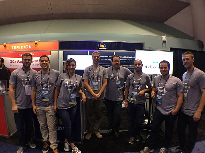
We decided to launch these new features at this Velocity event because it focuses on web performance. And as we’ve discussed in previous blogs, how images and videos are handled play a big part in load time and bandwidth usage of websites. Velocity gave us a great opportunity to talk with DevOps about how Cloudinary can help address many of the challenges they’re facing in managing media, simplifying the ability to transform images, while improving the user experience and saving them money in bandwidth costs.
As our CEO Itai Lahan noted, “Adapting an image to fit the graphic design on various devices and browsers, while optimizing performance, is both an art and science. Perfecting the image for every possible scenario can be a laborious process, and oftentimes is not feasible given time and manpower constraints, particularly when they must scale these efforts across thousands of images, or more, for a single site.”
For the past several years, Cloudinary has prided itself on delivering the tools to greatly simplify image management, but there were still a few manual steps that web developers needed to take. With the full automation we announced last week, we’ve simplified the process even further, providing the tools to enable developers to scale image management and deliver the best image to each user while automatically adjusting for each individual device, resolution, image content and graphic design layout.
Now with Cloudinary, you can upload a single high-resolution copy of an image, which is then automatically adapted in real time to focus on the most important region of the image, at the optimal quality and encoder settings, and then responsively delivered on any device at the proper resolution. The new automated features include:
-
Automatic Content-Aware Cropping – New content-aware cropping algorithms detect the region of interest in every image and then crop them on the fly using dynamic URLs to fit the graphic design and layout, on any device.
-
Intelligent Content-Aware Encoding – Automates the file size versus quality tradeoff decision by analyzing every image to find the best quality compression level and optimal encoder and encoder settings based on the image content and the viewing browser. This process produces an image that looks fine to the naked eye, while minimizing the file size.
-
Automatic Responsive Images – Determines the layout width of an image on a user’s device and the density of their screen, then decides how big of an image that user will need, and select and deliver an optimal resource – all at the CDN level.
-
Dynamic Format Selection – Optimizes image delivery by dynamically selecting the most efficient format, based on the image’s unique content and viewing browser, and converts the image to this format, in real time.
The debut of our fully automated solution was well received by Velocity attendees. We talked to a number of prominent brands – including those who run ecommerce, photo processing, real estate, auction, search engine and news sites. What we discovered is that many of these companies are using their own in-house image management systems, and are finding that these systems don’t scale as they employ responsive design and need various versions of the same image. Many of them admitted that even though they know responsive design is an absolute requirement, they didn’t understand all the complexities of doing it and how to manage the images in that environment.

In the exhibit hall, we did demos of Cloudinary’s automation, even showing one large company, in a matter of seconds, how they could fix a problematic image on their homepage, which they had been struggling to adjust using their own system. It’s safe to say that we WOW’d this company and many others with our demo….as well as our cool giveaways.
You can learn more about the technical details behind our “Images Solved” enhancements from a
blog post written by our CPO Nadav Soferman. And if you want to give it a try yourself, and be WOW’d with the simplicity, you can test drive these new features by
signing up for free.


